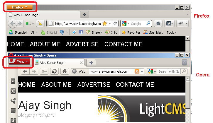
Today Firefox 4 is released after numerous 3.x.x updates. I just installed it and as soon as it restarted I was shocked to see that it’s design is a copy of Opera’s design.

I was even confused a little bit whether it is Firefox window or Opera as I used both web browsers.
That was the first impression of Firefox.
Next was the speed. Firefox 4 is faster than it’s predecessors. Firefox is notoriously slow thanks to it’s countless Add-ons. Even if you stripped it down to the bare minimum it will still remain slow. Google Chrome has been doing quire well in terms of speed and I normally used Chrome of browsing.
I haven’t done any lab test to find out how faster Firefox 4 is but I can tell from my experience that it is certainly faster than it’s predecessors.

Next feature, a copy of Opera’s design, is the little tool bar at the top left corner and rest of toolbar, buttons and menu which all either look a copy of Opera’s design or inspired by it.

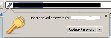
Another new feature is the remember Password box which pops out when you update the password. In previous versions it used to be a thin tool bar sliding down from the top.
If you haven’t upgraded firefox then better do it now.
Leave a Reply