Images in WordPress are great asset but it can be pain if you try to mess with it.
I just installed Sensational responsive theme on this blog and it turns out that the images are not automatically re-sizing to fit in the content area.
This simple issue should have been address by the theme developer.
If you insert an image and don’t add caption then image resize correctly.
But if you add caption then the images are not re-sized and it takes the size you specify in the attached image dimension.
The simple solution is to add this one line of code in the CSS file.
[sourcecode].wp-caption { max-width:100%; }[/sourcecode]
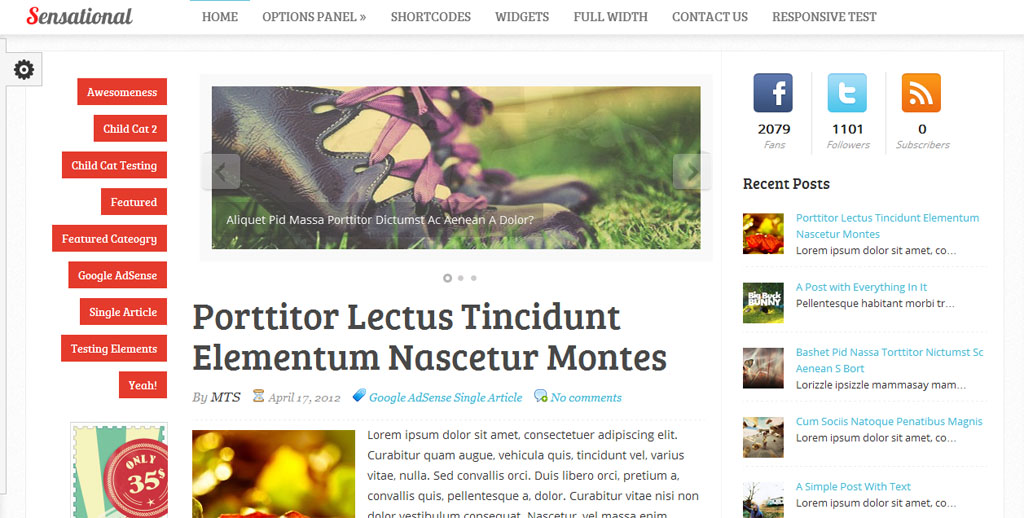
The image below has a width of 1024px and I’ve added caption in it. It works perfectly fine. You can re-size the browser to verify it’s responsiveness.

Leave a Reply